Visualising Covid-19 in Germany and its neighbours
Available data and countries
Data retrieved on: 12th July 2020
The full dataset is available from the European Center for Disease Control, which is updated daily.
Countries included in this visualisation are the neighbours of Germany:
- Denmark
- Poland
- Czech Republic
- Austria
- Liechtenstein
- Switzerland
- France
- Belgium and
- The Netherlands
As countries for external comparison, we have included
- China
- South Korea and
- Italy
The data falls into four categories:
- Number of new cases per day
- Number of new deaths per day
- Total number of cases (Cumulative number of new cases)
- Total number of deaths (Cumulative number of deaths)
New vs Total
The spread of the virus creates new cases every day. Thus, over time we expect the total number of cases and of deaths to increase. When the control strategy of a country starts taking effect, the number of new cases will decrease, and the total cases will saturate.
Thus we plot exactly these two values - New cases per day vs Total cases and New deaths per day vs Total deaths
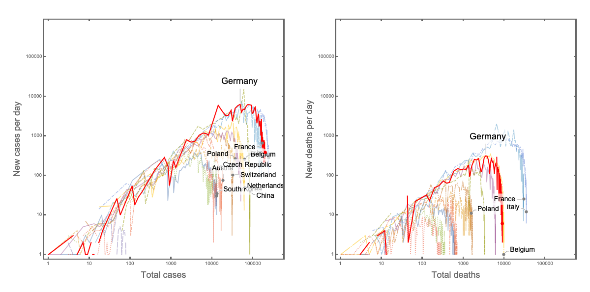
This figure provides us with a neat graphical view of the countries that have managed to drop out of the race.
The final (12th July 2020) positions of the countries are highlighted by the filled circles. We see China and South Korea as examples where the pandemic is under control - the new cases have reduced, and the total case are not increasing rapidly (note the logarithmic scale). These countries have essentially dropped out of the race! Italy and Germany, on the other hand, have a similar number of new cases (note the logarithmic scale). It is thus easy to see in this representation if the countries “fall out” of the trend.
The same effect is seen when focusing on the number of deaths per day vs total deaths that have occurred. The number of new cases is increasing in Germany. Nevertheless, the overall number of deaths is low as compared to some of its neighbours (France or The Netherlands).
Going from daily plots to trends
While the data is updated daily, it is possible to get hyped up by daily changes. When we look at the data over a certain period, it might be possible to get a better understanding of the trend in how the quantity of interest is changing over time.
For example, in the following plot, the total number of cases (vertical axis) has been plotted in function of time (horizontal axis). Note that we plot data as per described in the Exponentielles Wachstum und mögliche Gegenmassnahmen section, with a logarithmic scale on the y-axis.
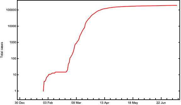
We see that over time the total cases have been increasing in Germany. To compare the growth with the neighbours of Germany let us plot additional lines for the neighbouring countries.
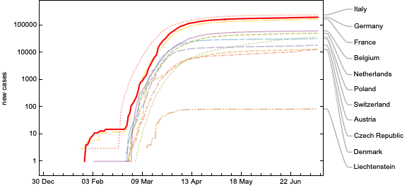
Again, note the logarithmic vertical axis. While the cases in Germany are in tens of thousands, Liechtenstein numbers in hundreds. We observe that Germany and France have almost the same increase in the total number of cases over time. If we draw a horizontal line through the final value of Poland (dotted green), we see that it intersected the lines of Germany and France approximately a month ago. This is read as - Poland is “a month behind” Germany/France in the Covid-19 pandemic.
Quantity today vs quantity yesterday
So how do we see if the pandemic is slowing down? If our corrective measures of sanitary activities and physical distancing are working? If the remedies work, in simplistic terms, the number of new cases would decrease.
So let us focus on the number of new cases today vs the number of new cases yesterday. However, instead of focusing on the absolute numbers, let us alter our perspective a bit. Instead of comparing new cases from today and yesterday directly let us take a ratio of today and yesterday. Thus if there were more cases today say 3 as compared to yesterday say 2, then the ratio gives us $3/2 = 1.5$. Instead, if the number of cases was lower today (say 1) than yesterday (say 5), then we will get $1/5 = 0.2$. If the number of instances per day remains the same (say 10), then we get $10/10 = 1$.
Thus with a baseline of 1 if the value is below 1, then the new cases are declining, and if above 1 then the disease is spreading faster.
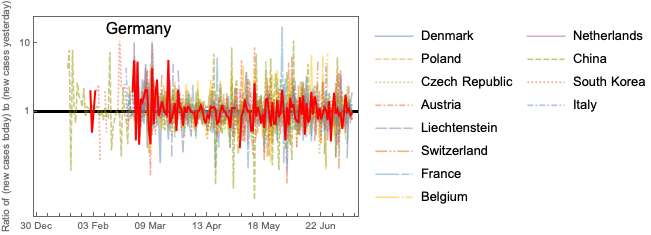
While this perspective is useful, the graph is still quite messy; hence it might help to look at not the daily change in the ratios but a mean per week to get to the trend of the data.
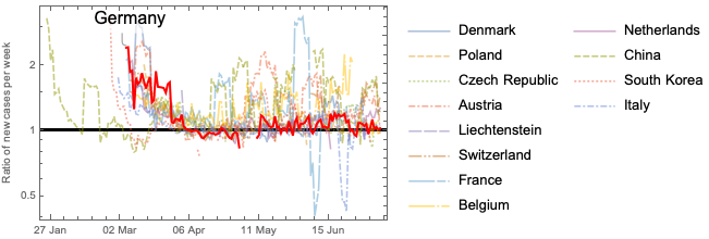
Now we can see clearly the trend over time. We see how the ratios in China and South Korea have dropped below 1 as the disease spread reduced. In Germany and the surrounding countries, the ratio is still above 1. That means the number of new cases per day is increasing in time. Overall, as the trend suggests the growth rate is decreasing over time and hopefully soon, we will reach 1. But the aim is to not only reach 1 but go below 1 if we want to eradicate the threat! Our hope is that the effectiveness of sanitary approaches and physical distancing will soon help all the countries drop below 1.